6 web accessibility quick wins that can make a huge difference for your users (plus 2 tips)
Small tweaks that you can easily add to your projects to make them more accessible.

I started learning web accessibility in 2019 when my team started working on a new project that needed to be as accessible as possible. I didn't know much about it, and I never really bothered to learn.
The QA in my team back then, Bruno Pulis is an accessibility evangelist. He showed me the ways of a11y and I finally understood what it was all about. I'm very thankful for his guidance. He has a project on Github called Awesome a11y which is a curated list of accessibility resources. Make sure to check it out.
So, what is accessibility all about?
Well, it's about empathy and allowing more people to use your applications, which is what we want anyway, isn't it?
Oh, this can also help you avoid trouble with the law. Remember when Domino's got sued by a blind man that couldn't use their website? Yeah... that could be your company.
There is a lot that you can do to make your websites more accessible, but there are some small tweaks that can help cover most issues visually and motor-impaired users face when navigating web applications.
Let's dive in.
1. Describe your images.
You've probably seen the alt attribute in img tags. But do you know what it does? Well, it adds a description to images so they can be interpreted by screen readers.
Let's take a look at this email I found on Google.
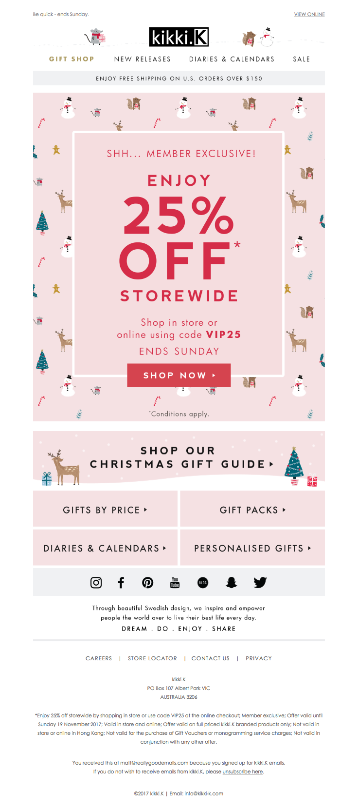
It's common nowadays to have emails with images since it allows you to send prettier emails to your users, but the issue is that if a blind user receives this, their screenreaders won't be able to read the information in the image like it would read a normal paragraph.
This can be fixed by adding an alt="" attribute to these images describing their contents.
For example:
<img src="./my-image.png" alt="Card with pink background and Christmas decorations with text saying: Shh... member exclusive. Enjoy 25% storewide. Shop in-store or online using code VIP25. Ends Sunday. Conditions apply. Tap to shop now" />
This text would be read to the user and they would be able to enjoy this offer if they're interested.
There are even some AI tools that can automatically do this for you which can be used in user-generated content, for example. Check out this article by Nino Ross on CSSTricks.
2. Describe your icon buttons.
You know, I love icon buttons. Icons provide a universal language that can be easily understood most of the time. We all know that a ❌ button closes a window, a ✏️ edits something and a ➕ adds something. But this is only true for people who can actually see these icons.
Let's take a look at this React code using Buttons from the Material UI library.
<Button>
  <Add />
</Button>

<Button>
  <Edit />
</Button>

<Button>
  <Delete />
</Button>

Beautiful, aren't they? But uh oh, they don't have any descriptions.
There are some options here:
You can add text to the buttons, so they would look like this:

This wouldn't match some use cases, like a close button in a modal window, or a table with many rows with actions. It would make the page feel too crowded.
Add
aria-labelto the buttons, which would be read by screen readers.The
aria-labelattribute is used only by screenreaders. When that element receives focus, the screen reader will announce whatever you add toaria-labelto the user.<Button aria-label="Add"> <Add /> </Button> <Button aria-label="Edit"> <Edit /> </Button> <Button aria-label="Delete"> <Delete /> </Button>This option solves the problem. Blind users would know exactly what the button does since they have a description now. But there is a better option.
Add a
title!<Button title="Add"> <Add /> </Button> <Button title="Edit"> <Edit /> </Button> <Button title="Delete"> <Delete /> </Button>I prefer this option because it helps all users, even the ones not using a screenreader.
The title will be read by a screen reader, just like
aria-labelwould, but if a user hovers this icon, they also get a nice hint of what it's supposed to do. This is important for icons that may not be clear at first.
I personally try to always use a title for icon buttons, since it's the option that fixes the issue and can avoid confusion, allowing for better UX.
3. Allow keyboard navigation.
Have you ever added a click event to a div? Well I know I have. Multiple times.
The issue with that is that a div cannot be tabbed into by default. That's not what a div is supposed to be used for, but maybe you really need it, and that's ok - as long as you make it keyboard-friendly!
Let's check this code out:
function Product() {
  const buyIt = () => {
    alert("Thanks for giving me your money, enjoy your finger hands.");
  };

  return (
    <div className="product">
      <img
        alt="Finger hands, tiny hands for your fingers."
        src="https://i.pinimg.com/originals/20/46/e9/2046e94f117577b4a5278362613715f5.jpg"
      />

      <div onClick={buyIt} className="BuyButton">
        Click here to buy finger hands!
      </div>
    </div>
  );
}
Results:
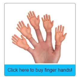
Well, we have a product that can be purchased now. But the main issue is that this product can only be bought if you have a mouse or a touch screen. A user navigating via keyboard (very common for motion-impaired and blind users) won't be able to tab into this div and make the purchase, which means you just lost a sale!
What can you do then? Well, I'd suggest using a button instead, since it's semantically better and has everything you need built-in.
But since you insist, you can add a tabindex to this div, making it an element that can be tabbed into. But that won't fix everything.
The button element's click event can be triggered by clicking on it with a mouse, tapping on it on a touchscreen device, or pressing enter or space on your keyboard while the element is focused.
If you use a div, you have to manually add these keyboard behaviors by adding onKeyDown and interpreting the pressed key. There are also some other important things that screenreaders need such as role. Depends on your use case.
This is what you would need to make this div behave like an actual button:
function Product() {
  const buyIt = () => {
    alert("Thanks for giving me your money, enjoy your finger hands.");
  };

  const handleKeyDown = (e) => {
    if (["Enter", " "].includes(e.key)) {
      buyIt();
    }
  };

  return (
    <div className="product">
      <img
        alt="Finger hands, tiny hands for your fingers."
        src="https://i.pinimg.com/originals/20/46/e9/2046e94f117577b4a5278362613715f5.jpg"
      />

      <div
        role="button" // <-- tells the screenreader that this element behaves like a button
        className="BuyButton"
        tabindex="0"
        onClick={buyIt}
        onKeyDown={handleKeyDown}
      >
        Click here to buy finger hands!
      </div>
    </div>
  );
}
This button can now be activated via keyboard as a button would. But there are also some other problems, like focus/hover states, which brings me to my next topic:
4. Add focus and hover states.
Let's consider the example above again. I didn't add any focus or hover styles to it. Thankfully, nowadays most browsers will add some default styling for focus states. Chrome uses this:
:focus {
  outline: -webkit-focus-ring-color auto 1px;
}
Which makes the div look like this when focused:
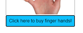
This is great, but maybe it won't match your website style. I've seen people simply removing these styles globally because they don't like them.
Please, do not do that. Add an alternative instead.
The most important ones are :hover and :focus. Try to add these to activatable elements. This is not even just about accessibility, this is a basic UX practice.
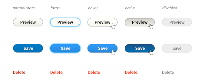
This one is very simple to understand, but so many websites miss this. Even people without disabilities can face this problem. Maybe their mouse is broken or maybe they're just faster navigating via keyboard, and if you miss these states, they won't know which element is currently focused, which is a major UX pitfall.
So, make sure to add them to your components.
5. Add labels to your input fields.
This is another issue that can bother every user and is also a UX problem. Forms that don't have associated input labels can be hard to understand, especially if you have many input fields.
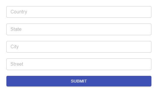
Using only the placeholder works at first, but once this form is filled, it may be hard to figure out what each field is supposed to represent.
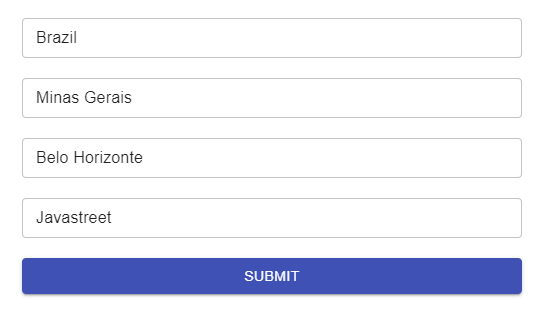
Screen readers will read the placeholder and provide information to the users, but a label is far better since it keeps the input description on-screen at all times, avoiding confusion when re-reading the text fields.
The best solution here is to use a label for each field and use for to let the screenreaders know which field the label is related to.
<form>
  <label for="country">Country</label>
  <input id="country" />

  <label for="state">State</label>
  <input id="state" />

  <label for="city">City</label>
  <input id="city" />

  <label for="street">Street</label>
  <input id="street" />

  <button type="submit">
    Submit
  </button>
</form>
6. Use colors with good contrast.
Color contrast is important for people with low vision, colorblindness, or even a device with low brightness in a place with a lot of light (like outside - remember going outside? I miss those times).
The WCAG spec has three conformance levels: A, AA, and AAA. Each with its own enhanced rules, but I'll only talk about contrast for now.
The minimum you should try to aim for is AA, which requires a color contrast ratio of 4.5:1 for small text and 3:1 for large text. For icons, borders, and other visual elements, WCAG 2.1 requires a minimum ratio of 3:1.
How can you check the contrast ratio between two colors? You can use the contrast checker website or your browser's devtools, which will have this built-in.
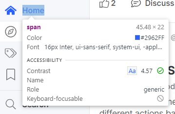
As you can see, Hashnode's brand color works well on a light gray background, having a contrast ratio of 4.57:1.
So, always check if your elements have enough contrast. Many tools can inspect your page for that, like Axe, which I'll talk about below.
All done!
Thanks for reading this so far!
These are six simple things that you can do that will help your users a lot. Seems pretty basic but so many websites don't even bother adding those, which is a sad thing since the web should be more inclusive and usable by everyone.
There are many other things you can do to make your applications accessible, you can read about them in the WAI-ARIA spec and the WCAG spec, which provides standard guidelines for web accessibility.
Two extra tips that can help improve the accessibility of your applications
1. Use a framework that has built-in accessibility.
Most popular frameworks nowadays care about a11y. Material UI and Vuetify are working hard on providing accessible components that work out of the box. Their custom components like dropdowns already tackle keyboard navigation and provide enough contextual information for screenreaders to guide users and allow them to use your applications easily.
Maybe you don't want to use one of those, and want to make your own component with your own styles. You can read the a11y guidelines from the WAI spec or use a customizable component library that already handles accessibility for most common web components. Some examples are Reakit, for React and Vuetensils, for Vue.js.
2. Use an accessibility analysis tool.
I use Axe devTools on Chrome (also available for firefox).
Axe can analyze your web applications and point out accessibility faults, providing enough information on how to fix them and documentation on why they're important.
For example, this is an inspection of a StackOverflow question page using Axe devTools:
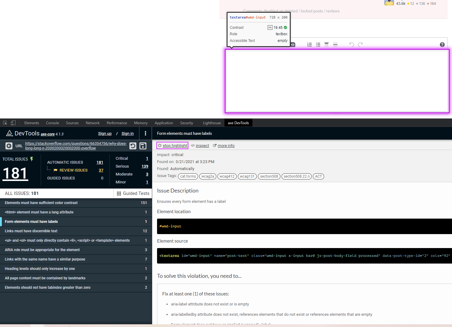
Pretty helpful stuff here, so I'd suggest that you install this and run it on the last web application you've worked on. You will be surprised.

